
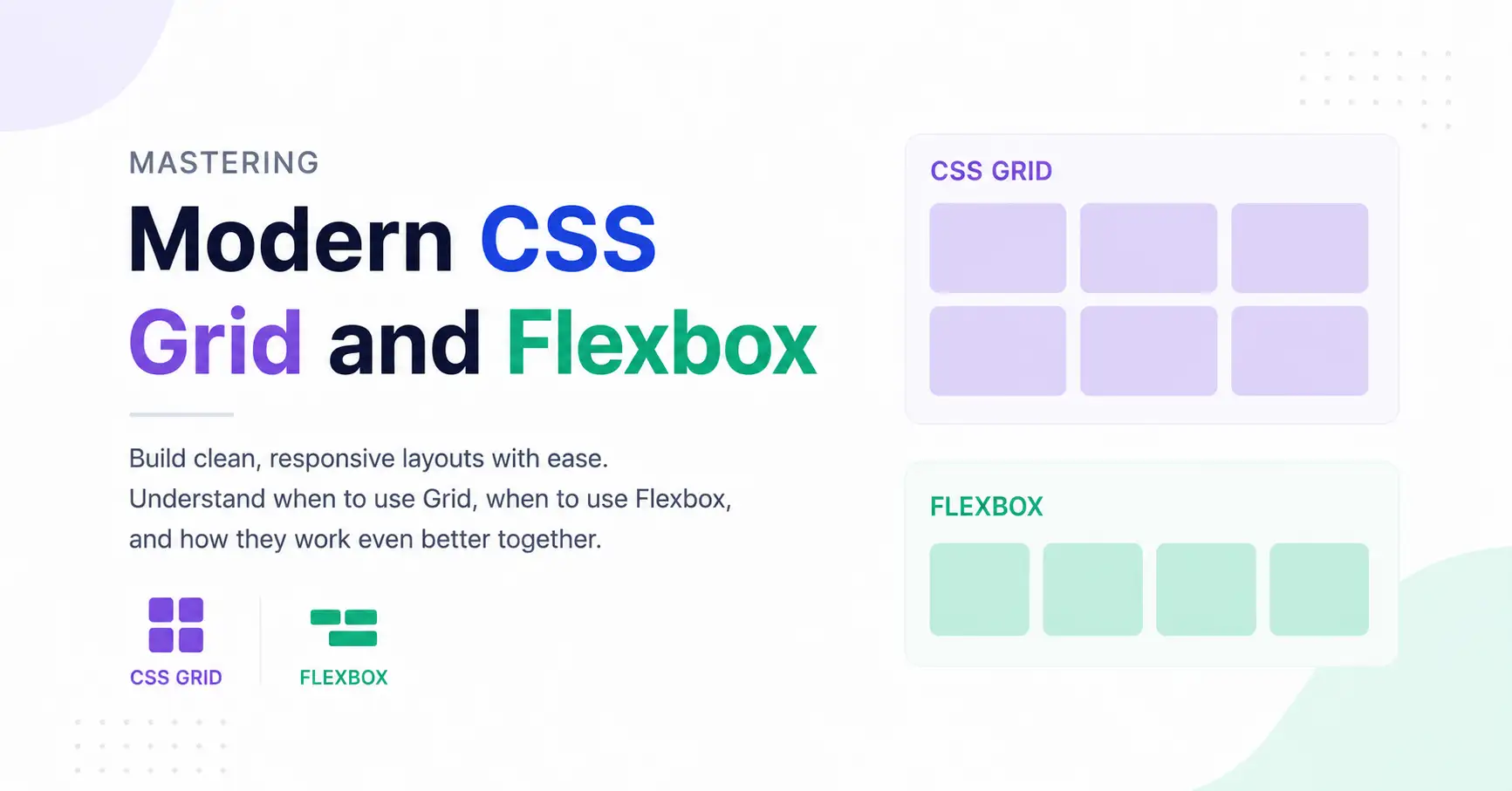
If you've been building websites for a while, you've probably experienced this.
You add a new section to your page.
Then suddenly...
One element jumps to the next line.
The spacing becomes inconsistent.
Mobile view breaks.
And before you know it, you're adding
margin-left: 27pxjust to "make it work."
Sound familiar?
The good news is that modern CSS solved most of these problems years ago through Flexbox and CSS Grid. The challenge isn't learning the syntax—it's understanding when to use each one.
Let's simplify that.
Before Flexbox and Grid
Years ago, developers relied on:
Floats
Position absolute
Tables (yes, really!)
Countless clearfix hacks
Creating even a simple three-column layout felt like solving a puzzle.
Imagine building this:
-----------------------------------
Logo      Navigation       Profile
-----------------------------------
Earlier, this required floats, clearing elements, and sometimes JavaScript fixes.
Today?
It's literally one line:
display: flex;That's the power of modern CSS.
Flexbox: Layout in One Direction
Think of Flexbox as arranging books on a shelf.
You decide:
horizontal
vertical
Then Flexbox handles the spacing.
It's perfect when your content flows in one direction.
Examples include:
Navigation bars
Buttons
Card actions
Toolbars
Header sections
Example: Navigation Menu
HTML
<nav class="navbar">
    <a>Home</a>
    <a>Blog</a>
    <a>Projects</a>
    <a>Contact</a>
</nav>
CSS
.navbar{
    display:flex;
    justify-content:space-between;
    align-items:center;
}
Result:
Home Blog Projects ContactNo floats.
No hacks.
Just clean CSS.
But What Exactly Does justify-content Do?
This confuses almost everyone initially.
Imagine four people standing in a room.
Now ask yourself:
How should they stand?
CSS gives multiple answers.
justify-content:flex-start;A B C Djustify-content:center; A B C Djustify-content:space-between;A B C Djustify-content:space-evenly; A B C DSee how we're simply controlling the empty space?
That's Flexbox.
What About align-items?
Now imagine everyone in the room is standing at different heights.
Should they align at:
the top?
the center?
the bottom?
align-items:center;Everything becomes vertically centered.
This is one reason why modern developers rarely struggle with vertical alignment anymore.
CSS Grid: Two-Dimensional Layout
Now let's switch scenarios.
Suppose you're creating:
a dashboard
a gallery
a pricing section
a product listing
Can Flexbox do it?
Yes.
Should it?
Usually not.
Because now you're arranging items in rows and columns simultaneously.
That's Grid's specialty.
Example: Product Cards
<div class="products">
    <div>Product 1</div>
    <div>Product 2</div>
    <div>Product 3</div>
    <div>Product 4</div>
</div>
CSS
.products{
    display:grid;
    grid-template-columns:repeat(2,1fr);
    gap:20px;
}
Output
+---------+---------+
| Product | Product |
+---------+---------+
| Product | Product |
+---------+---------+
Notice something?
We never calculated widths.
Grid handled everything.
The Magic of repeat() and fr
Many beginners write this:
grid-template-columns:50% 50%;It works...
Until padding arrives.
Or gaps.
Or borders.
Instead use:
grid-template-columns:1fr 1fr;Even better:
grid-template-columns:repeat(2,1fr);Here, fr means fraction of the available space.
Imagine your layout is a pizza.
1fr 1fr
means:
Split the pizza equally.
Want three equal columns?
repeat(3,1fr)Easy.
Building Responsive Layouts Without Media Queries
Here's one of my favorite Grid features.
Instead of writing multiple media queries...
@media(max-width:768px){
    ...
}
Try this:
grid-template-columns:repeat(
    auto-fit,
    minmax(250px,1fr)
);
Now ask yourself:
What happens if the screen becomes smaller?
Grid automatically reduces the number of columns.
Desktop
□ □ □ □Tablet
□ □ □Mobile
□
□
□No additional CSS required.
That's modern layout design.
Can Flexbox and Grid Work Together?
Absolutely.
In fact...
They should.
Here's a common real-world structure:
Page
│
├── Header (Flexbox)
├── Sidebar + Content (Grid)
├── Cards (Grid)
├── Card Footer (Flexbox)
└── Navigation (Flexbox)
Grid handles the page structure.
Flexbox aligns the content inside each section.
Professional developers rarely choose one over the other—they combine both.
A Practical Example
Imagine you're building a blog homepage.
The overall layout:
----------------------------
Header
----------------------------
Sidebar | Articles
----------------------------
Footer
Use Grid.
Now look inside an article card.
Image
Title
Description

Author     Read More
Use Flexbox for the bottom row.
Each tool solves a different problem.
Flexbox vs Grid
Feature | Flexbox | CSS Grid |
|---|---|---|
Direction | One-dimensional | Two-dimensional |
Best For | Navigation, buttons, toolbars | Dashboards, galleries, page layouts |
Rows & Columns | Limited | Excellent |
Alignment | Excellent | Excellent |
Responsive Layouts | Good | Outstanding |
Which One Should You Learn First?
If you're just getting comfortable with modern CSS, start with Flexbox. It's easier to grasp and you'll use it almost every day.
Once you're comfortable arranging elements in a single direction, move on to CSS Grid. That's where you'll unlock more complex layouts like dashboards, galleries, landing pages, and admin panels.
The goal isn't to replace one with the other. It's to recognize which tool fits the layout you're building.
Final Thoughts
Modern CSS isn't about memorizing every property. It's about understanding how layouts behave.
The next time you start a new component, pause for a moment and ask yourself:
Am I arranging items in one direction? → Use Flexbox.
Am I designing rows and columns together? → Use CSS Grid.
That one question can save you hours of debugging and make your CSS cleaner, more maintainable, and far easier to scale.
As your projects grow, you'll notice something interesting: the best layouts aren't built by choosing Flexbox or Grid—they're built by knowing exactly when to use each.
Comments (0)
Want to join the conversation?
Log in or create a ShubhamLabs account to leave a comment.